Janelle - like BEYONCE - identifying the new signal of Janelle Olson inside the Signal Masterclass
Great branding should never overwhelm the work. It should clarify what was already there.
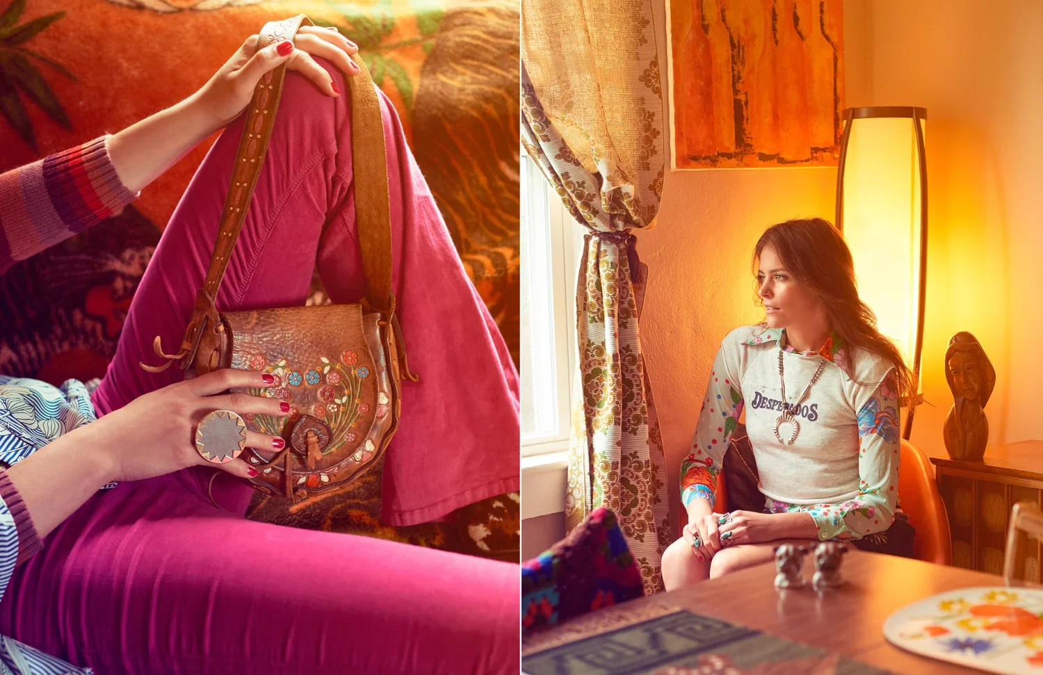
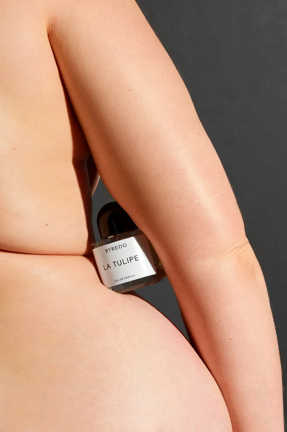
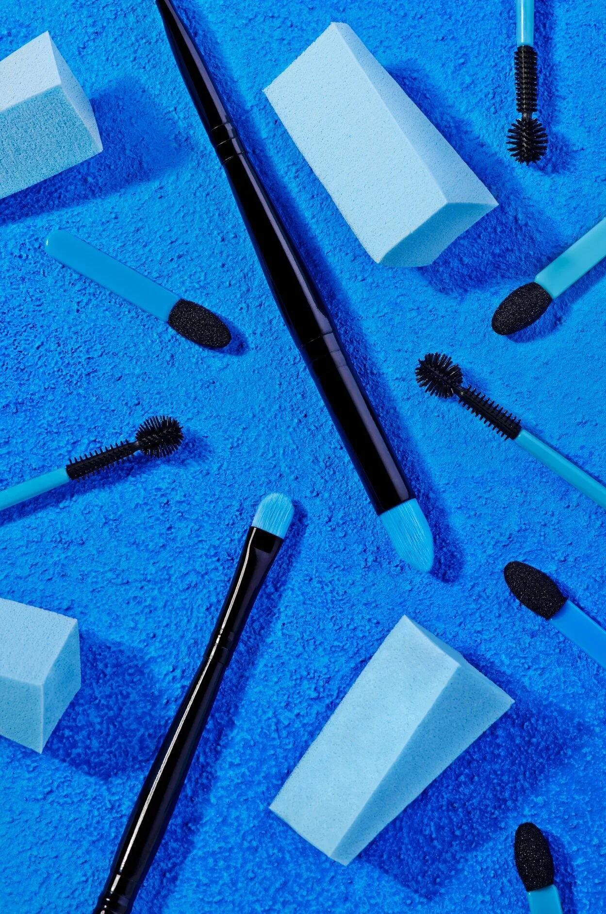
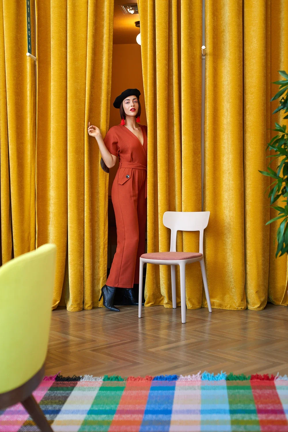
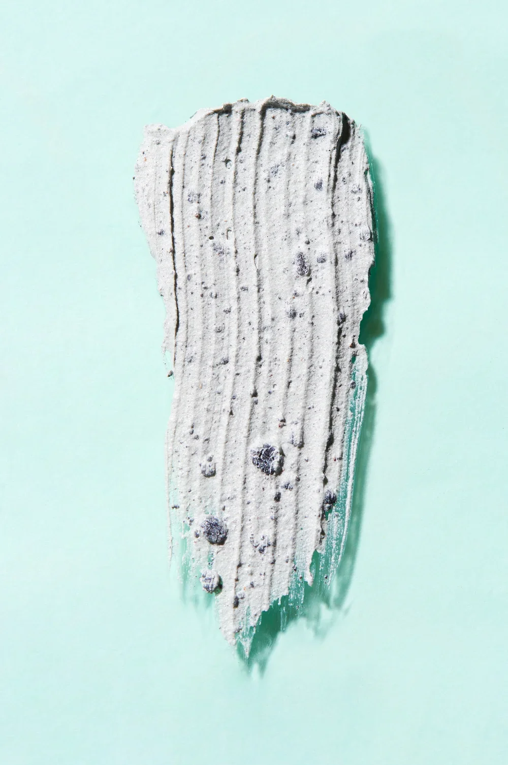
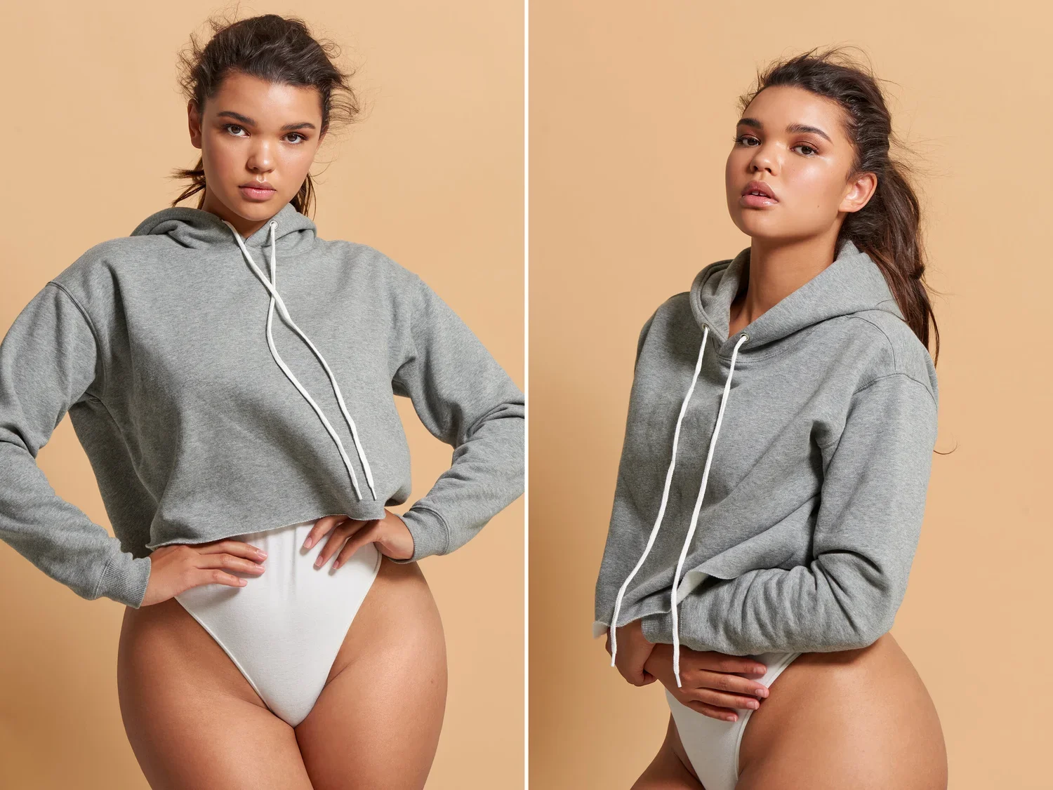
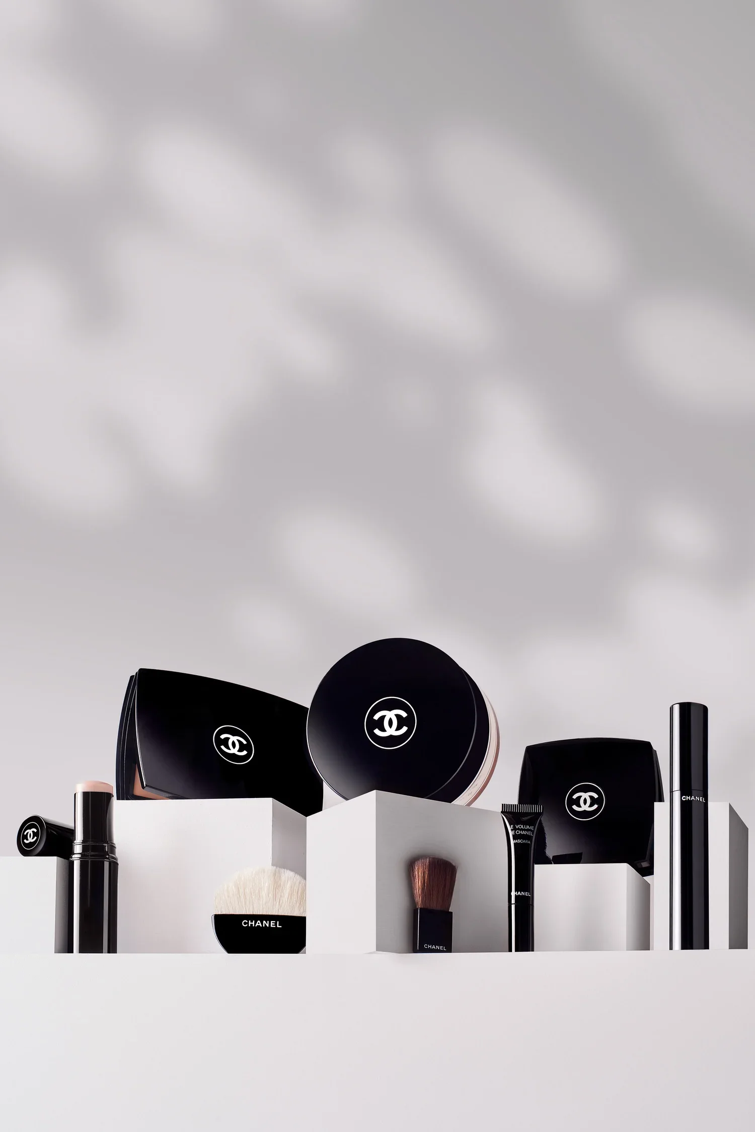
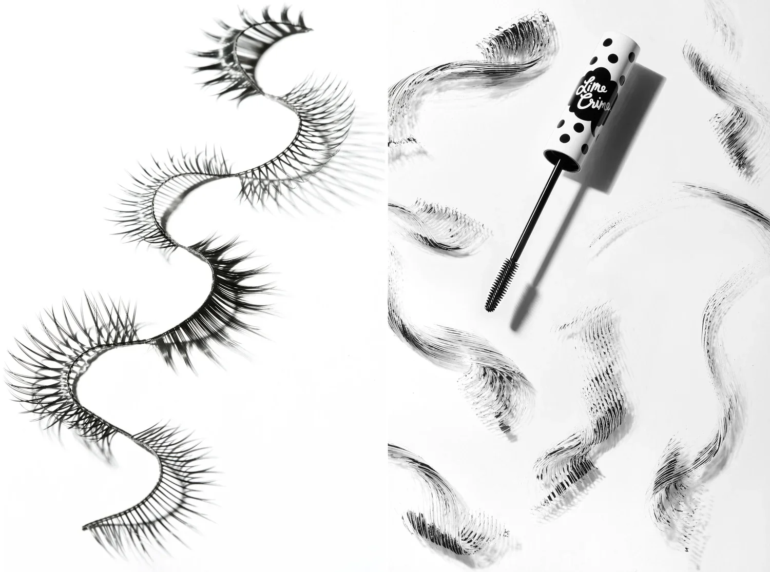
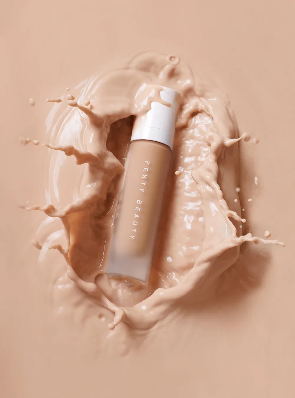
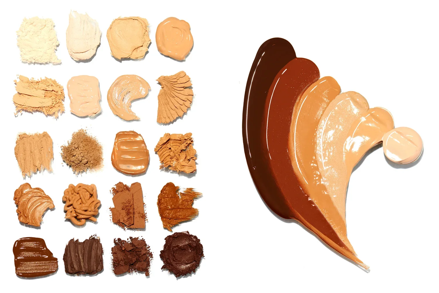
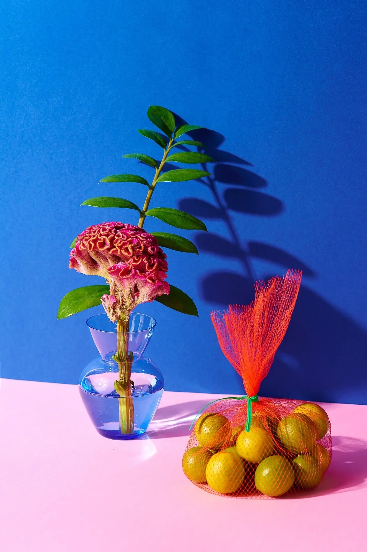
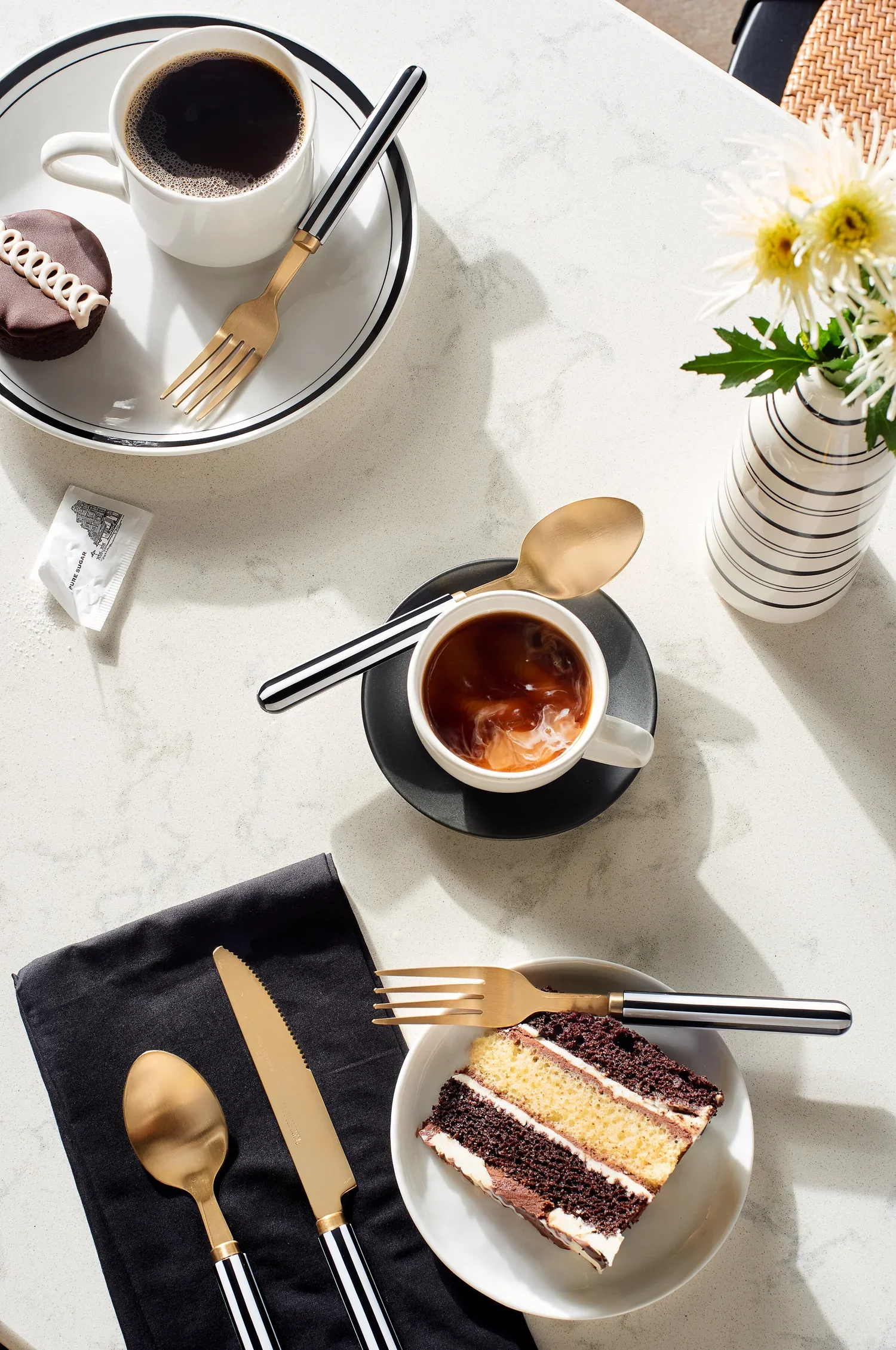
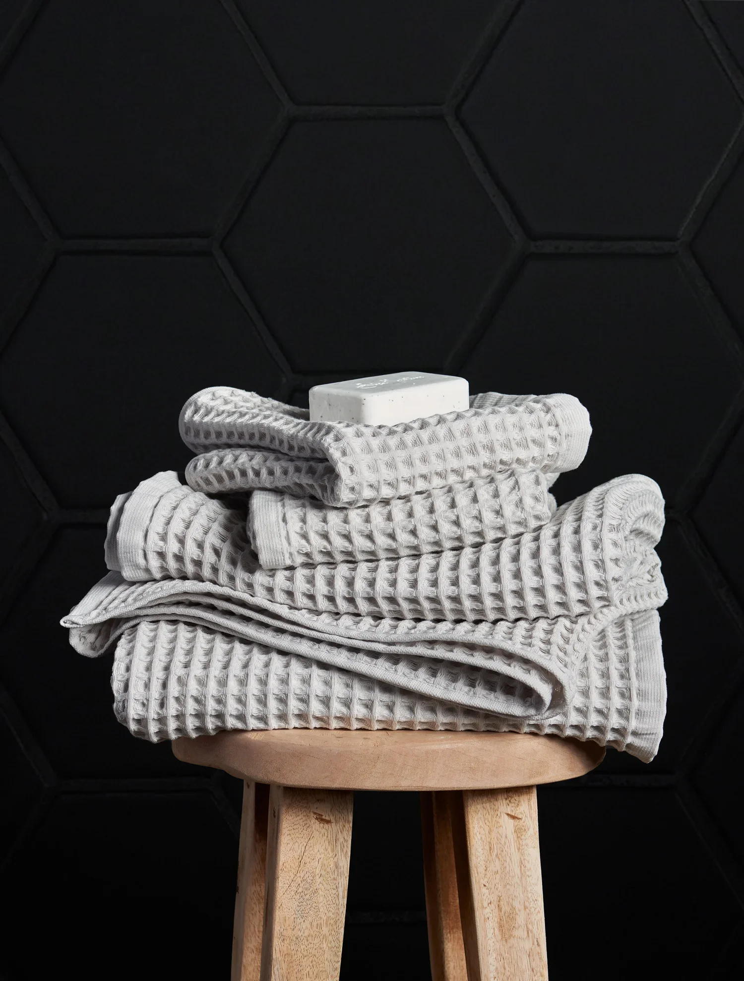
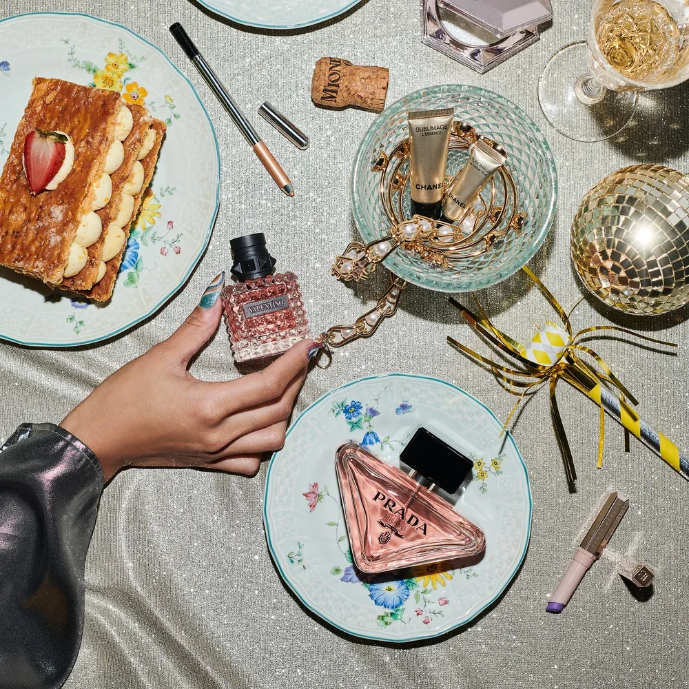
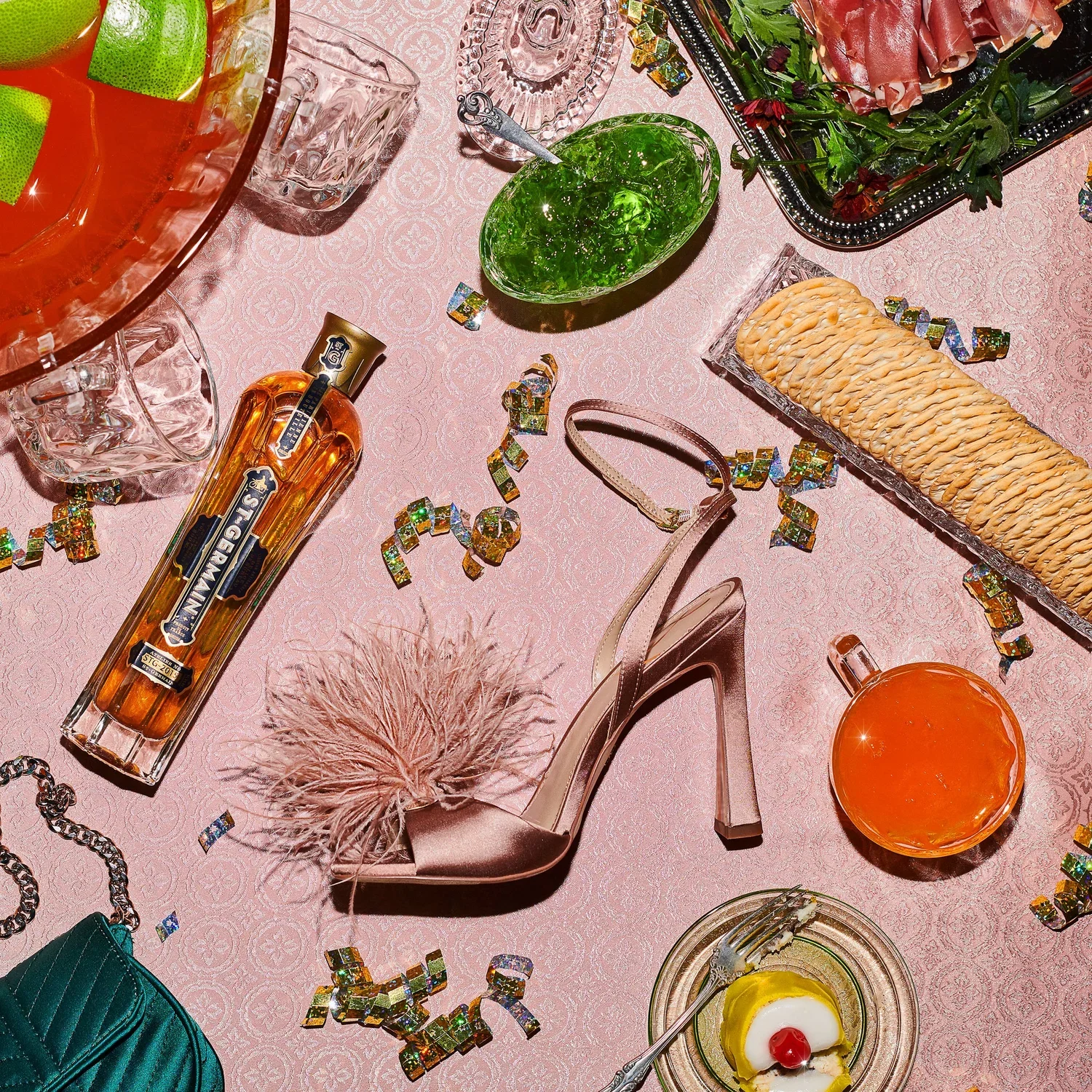
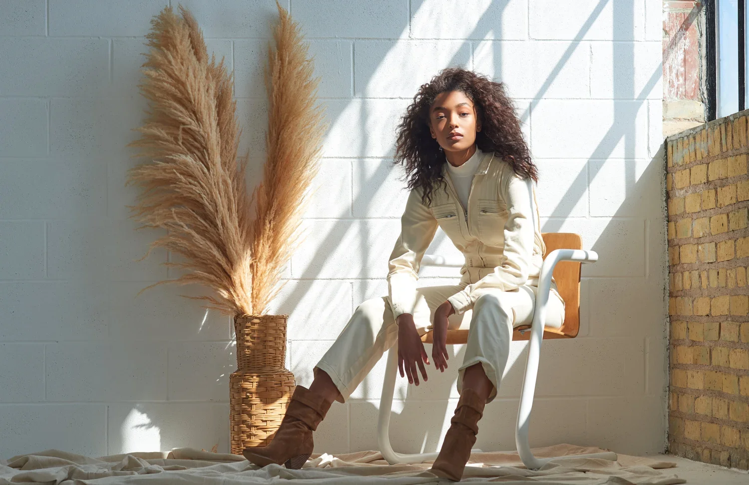
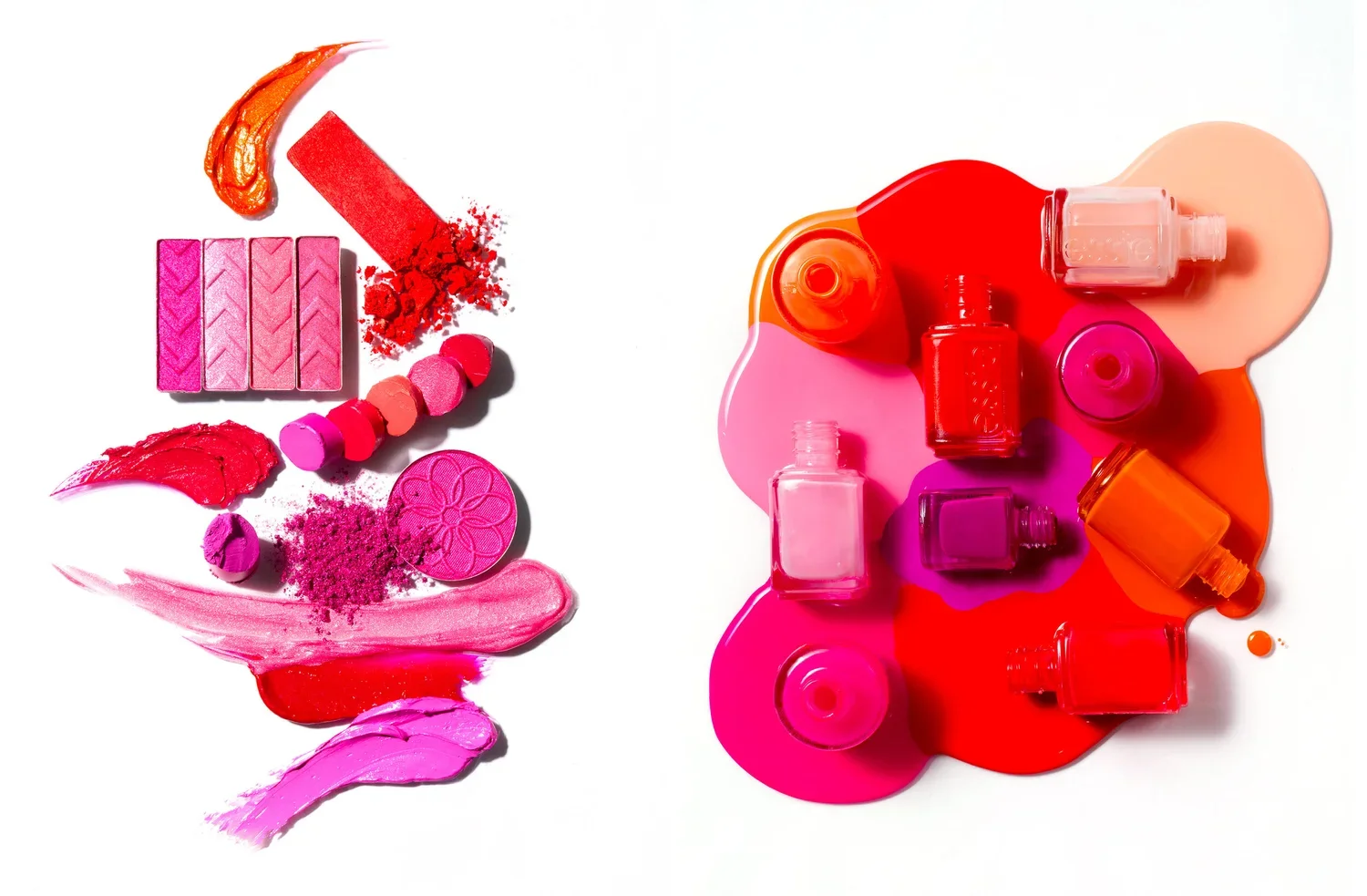
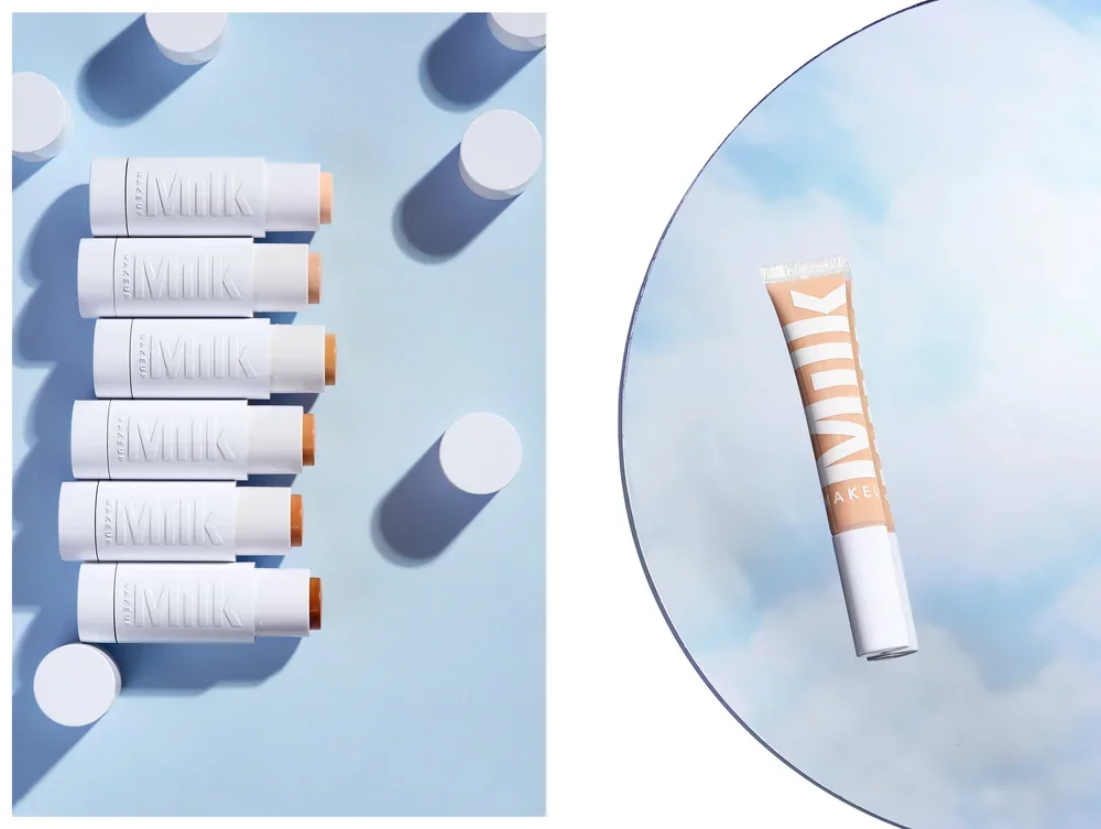
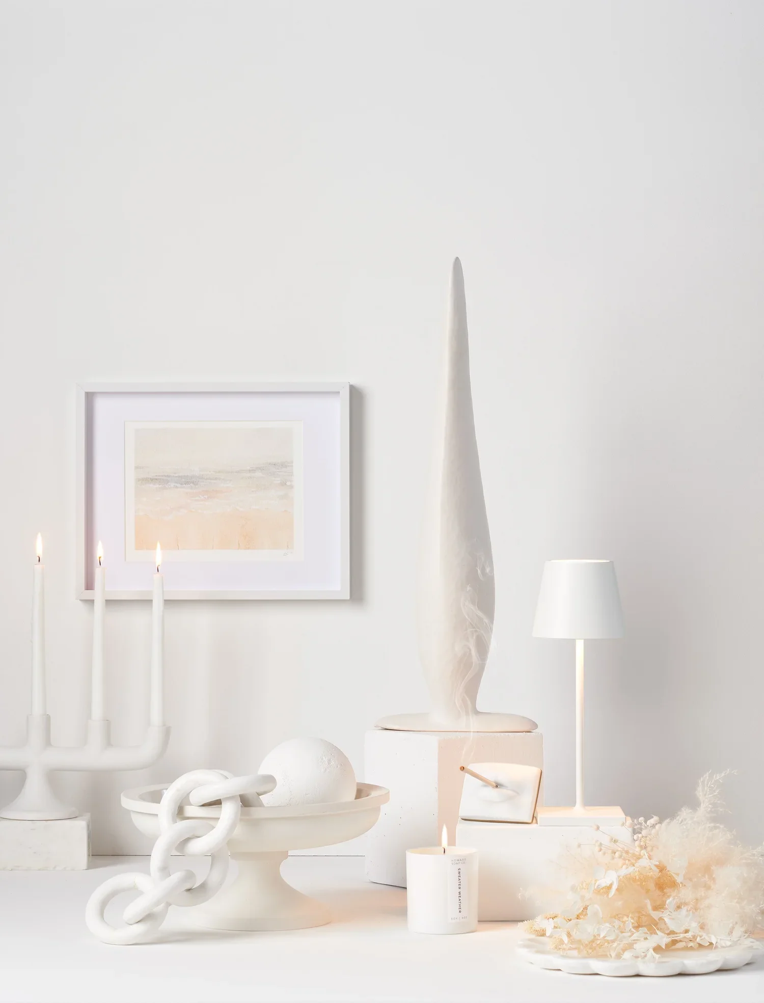
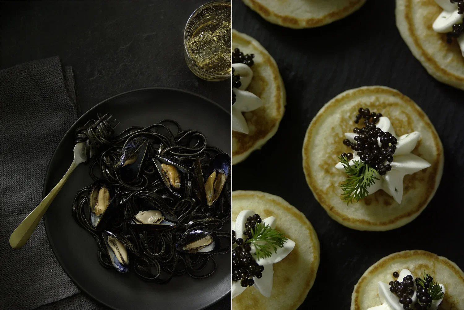
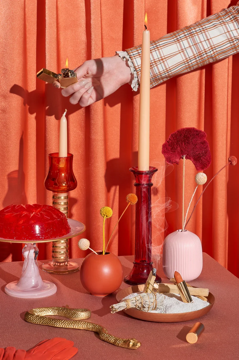
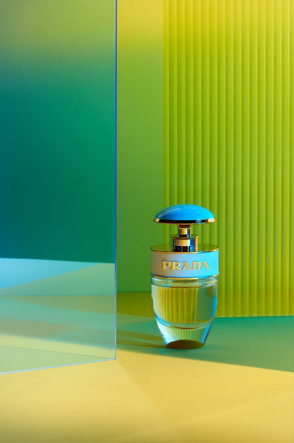
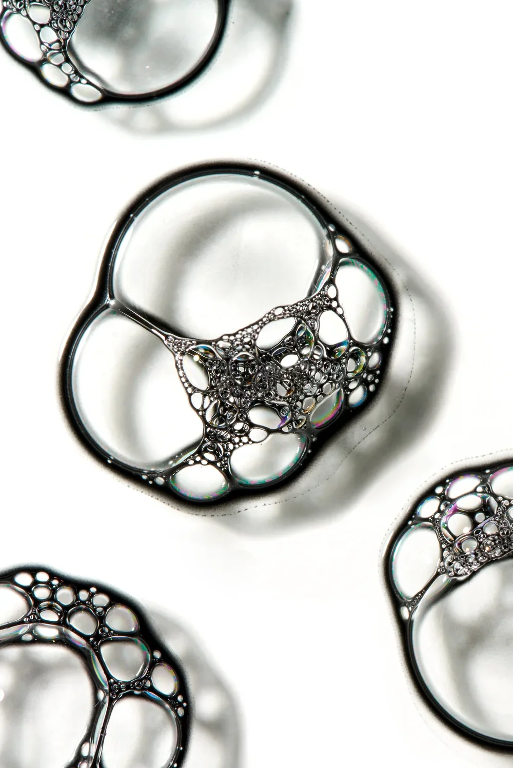
When we began developing a new identity for photographer and director Janelle Olson, we started by looking closely at the visual language within her images. Janelle’s work is polished and commercially precise, but it also carries a strong editorial sensibility. Her photographs of beauty, cosmetics, texture, and form often feel architectural—carefully composed, tactile, modern, and quietly luxurious.
The goal was to create an identity that could hold all of those qualities without becoming overly decorative or traditionally feminine. We wanted something confident, timeless, and refined—an identity capable of sitting beside the work without competing with it.
The process became an exercise in restraint.
We explored a stark black-and-white palette, generous negative space, and typography inspired by the confidence of modern beauty and fragrance brands. The final wordmark—JANELLE.—is deliberately minimal: clean uppercase lettering, carefully considered spacing, and a decisive period that gives the name both presence and finality.
That small period became important. It turns the logo from a simple name into a statement.
The resulting identity feels closer to an editorial masthead or the invitation to a gallery opening than a conventional photographer’s logo. It can live quietly in the corner of an image, hold its own on a black screen, or become part of a larger campaign without disrupting the photography.
For us, the most successful part of the process was not inventing a new persona for Janelle. It was recognizing what had always been present in her work—precision, sophistication, sensuality, and strength—and giving those qualities a clear visual signature.
The finished identity does exactly what we hoped it would do:
It doesn’t ask for attention before the photographs.
It creates the space in which they can be seen.